THE CROMWELL APARTMENT
Versatile colour schemes and subtle textures mark the renewal of this modern apartment in London.
This once-tired rental is now a light, bright contemporary haven for its young
owner, who is able to update the sleek, neutral schemes with decorative additions when she feels like a change.
The Details
Who: A young international student, who’s parents wanted to both invest and have a place for their daughter to feel like home. She currently lives here with her best friend and small dog.
What: A contemporary upgrade of a two bedroom, two bathroom apartment on the 10th floor of a modern development.
Where: Cromwell Road London
The Brief
The client wanted a modern, practical upgrade to her apartment that would both add value to the property while reflecting her needs and personal style.
Although the client had a penchant for earthy colours, such as soothing sage green, it was decided that a neutral base would keep the appeal for future buyers, while allowing her to add pops of desired colours and textures through small accessories and wall art.
Before
Having previously been a rental property, the apartment was tired and worn, and didn’t reflect the client’s personal design preference.
A big area of contention was the kitchen space that was lacking in worktop space and had inefficient appliances for the client’s needs. Elsewhere, the dark, patterned floor in the open plan area made the room feel oppressive and unbalanced, while the carpets in the bedrooms were impractical for dogs.
How we achieved it
Akiva’s interior designer, Betina, worked with a minimal aesthetic throughout the apartment, applying an abundance of neutral yet warm tones.
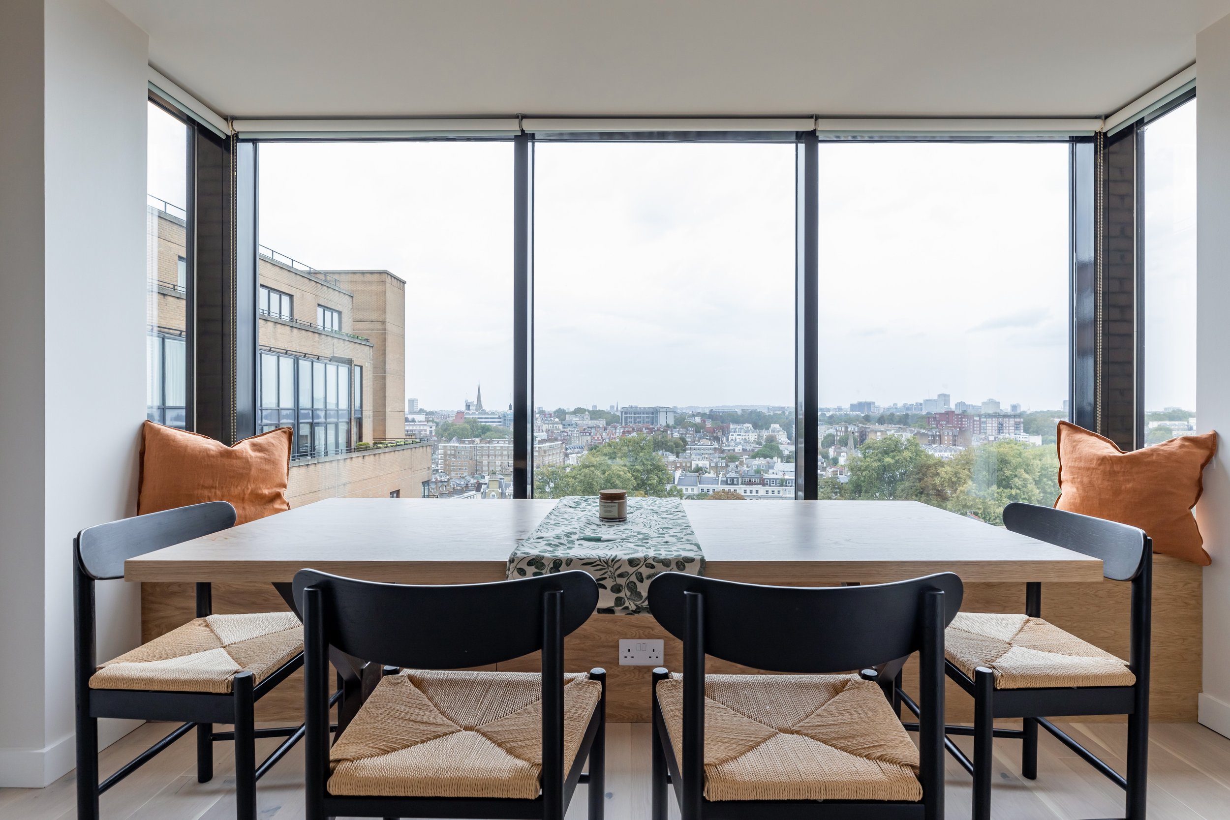
The orientation of the open plan living space was rejigged, creating a dining space in front of the show stopping window and a TV area in a more practical position.
Bespoke solutions were then designed for these new areas to ensure versatility and functionality, including a dining bench with hidden storage and a wall hung media unit.
To maintain a light and airy ambience that flows from room to room, pale timbers were chosen as the hero material, such as light oak for the media unit, and warm teak for the bathroom vanities.
These cosy, tactile textures, thoughtfully-planned solutions and warm neutral tones combine to create an inviting home that ticks the modern day living box, and ensures continuing appeal to future buyers.
The design process
As the client was based in the Far East, she couldn’t be present for the entirety of the refurbishment, so she opted for our Premium Makeover packages, giving her a clear vision of the end result through detailed coloured floor plans and 2D elevations. Once the design was finalised, the client then chose our Takeover post-design package, which involved us managing the project, liaising on deliveries, uploading digital reports to keep her up to date, and ensuring the contractor delivered the design accurately.
““Thanks to Akiva’s honest ethos, efficient
systems and clear communication platform, they can easily work with remote clients wherever they are in the world.””
Our online Interior Design Services
Our online interior design packages are integral to our award-winning services. Akiva has a vast amount of supplier and product knowledge nationwide and across Europe.
Take a look at our online interior design packages here.
“I have collaborated with James on the refurbishment project of my new flat. James and his team are experienced, well organised and offer professional service with a reasonable price. All the furnitures and materials arrived in timely manner while I was away May-August. The refurbishment process has minor delay due to management paper work, James handle them quite well nevertheless.
James introduced me to my contractor John, who’s the one carry out on-site works. John handle all the details with care and finish the the project with high quality. I will be happy to work collaborate with John as my long-term contractor.
Really please with this collaboration :)”
A Dramatic Yet Functional Focal Point
Blessed with an extraordinary bay window with sweeping London views, this striking focal point became the hero of the open plan room. Where before a sofa blocked the city vistas, a bespoke timber bench now stretches its full width, providing plenty of space for friends and family to gather round the purpose-built dining table from Cosy Wood, which fits the space perfectly. Hidden storage beneath the bench is invaluable, while nifty power sockets offer the ideal spot when working from home. Bespoke display shelves were also added to the side of the dining area, preempting where the client will eventually have her piano.
Throughout the entire project, the interior designer kept one eye on the client’s wants and needs, while also ensuring the apartment remained appealing to future buyers. Hence, the warm neutral scheme is kept minimal, allowing textures and accessories bring the interest.
Timeless Solutions
Previously, an unsightly shelving unit covered the entire wall making the room feel closed in and cluttered, so this was removed and replaced with a dedicated media area, defined by beautifully crafted timber units. A combination of hidden storage for dog paraphernalia, and open display shelves for books, creates a stylish and sophisticated feel, while the classic pale oak finish adds a timeless quality that will work with many different interior styles.
Top Tip
Investing in bespoke furniture that is uniquely made to your specification in terms of colour, style and size, not only gives your home timeless appeal, it will also provide the exact storage for your needs.
This piece was created using Akiva’s level 2 furniture design package
Cool Surfaces Teamed With Warming Hues
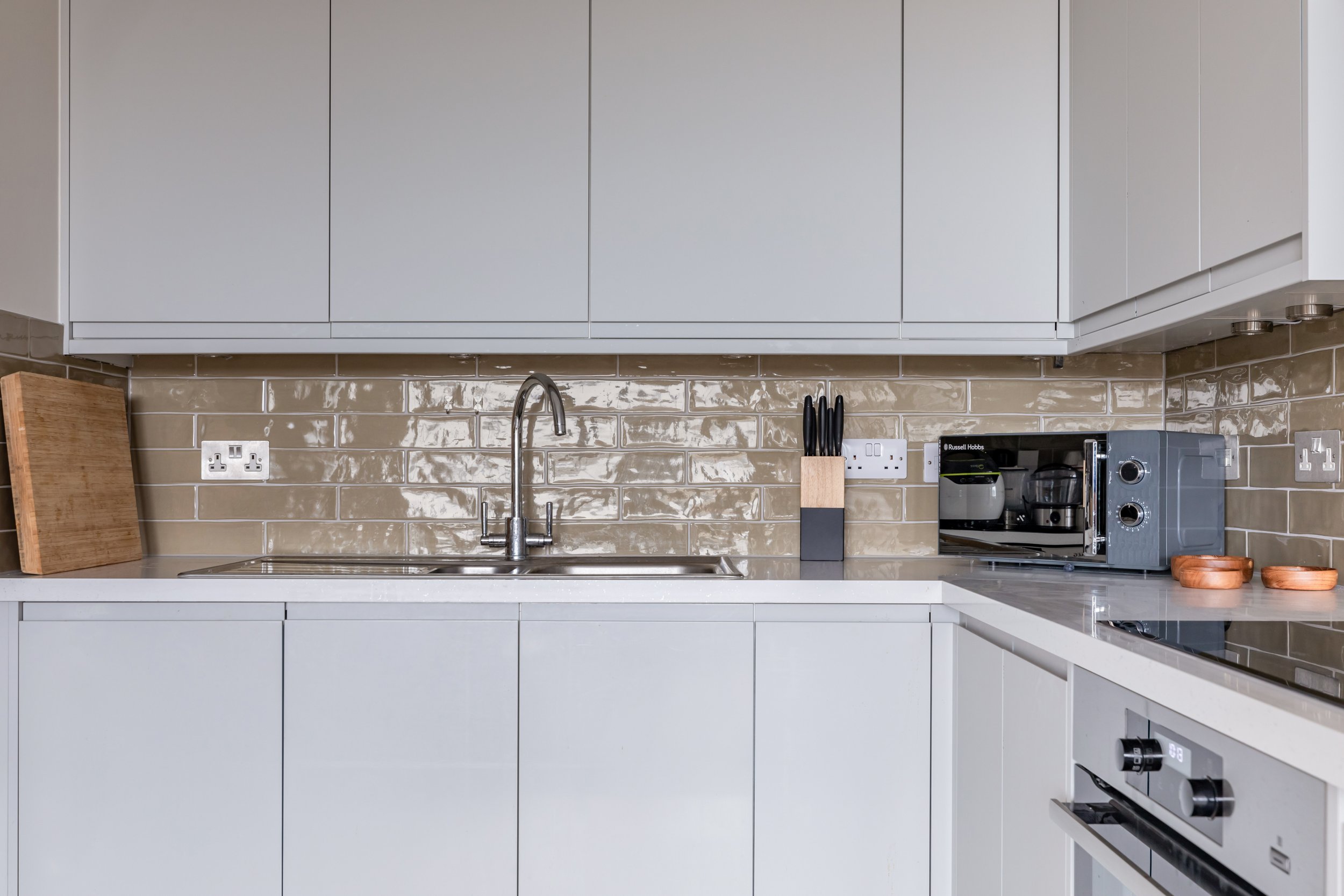
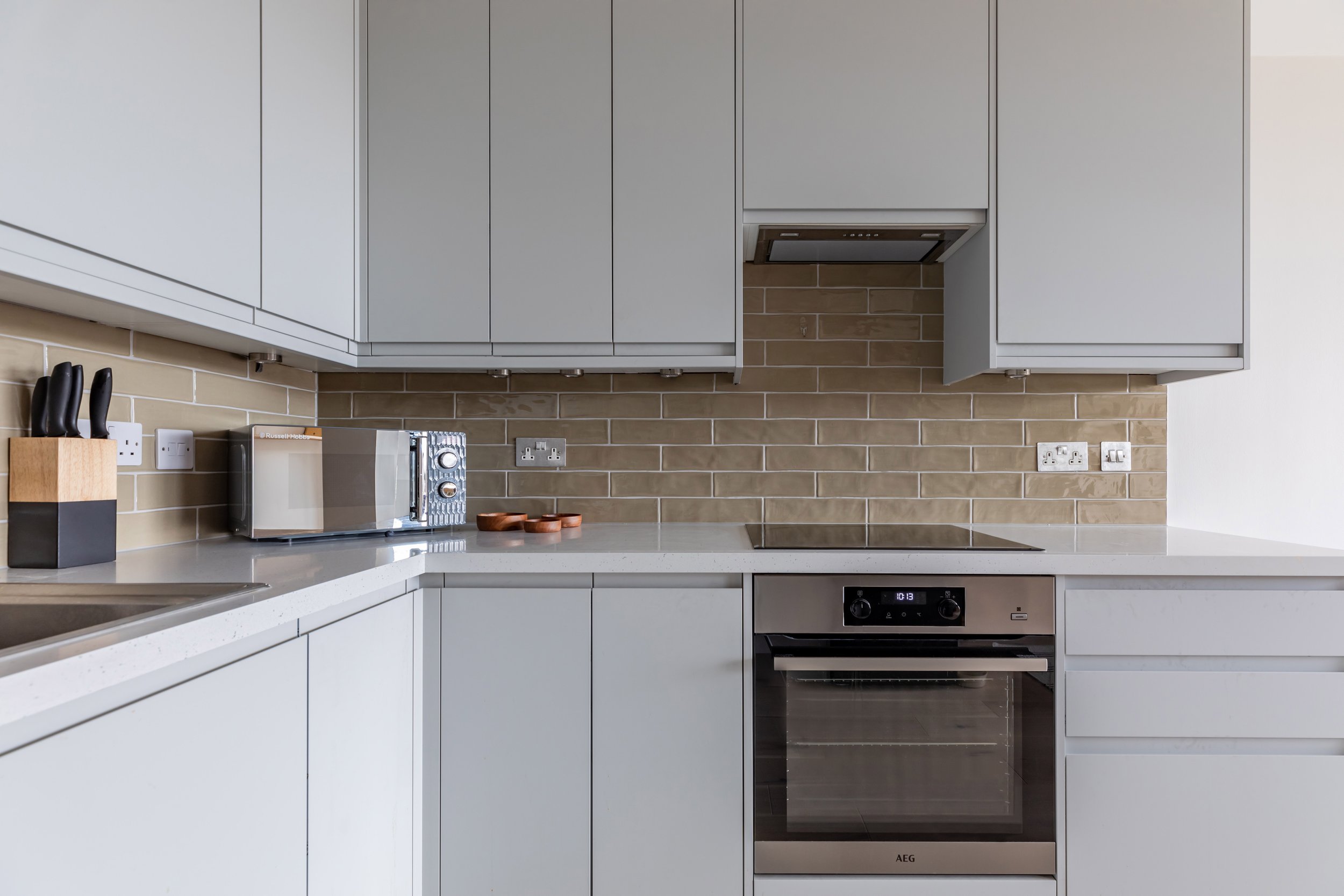
As the kitchen space merges seamlessly into the open plan living area, it needed to feel cohesive with the seating and dining zones. However, the existing dark wooden kitchen did the complete opposite, creating an oppressive feel. So, to brighten the U-shaped space, light grey handleless cabinets were chosen for their clean, contemporary and uncluttered aesthetic - essential in an open plan room.
To avoid the cool grey cabinetry feeling stark and cold, the units were paired with earthy brown tiles featuring a sage green undertone. The result is an elegantly modern cooking space that is calm, considered and highly practical.
Top Tip
When it comes to the big investments, such as the kitchens and bathrooms, choose a style that makes you happy and not just a trend that you think you should follow. Interior fads can have a big influence on our decisions, however, they can also lead to expensive mistakes, so experimenting with smaller finishing touches is a safer way to introduce new looks.
Reworking The Layout
The interior designer worked closely with the client to understand her wish list for the new kitchen layout. Previously a double refrigerator had taken up a lot of valuable space limiting the worktop area, while the washing machine and dishwasher were squeezed into an awkward corner. To rectify this layout conundrum, space was clawed back by opting for a single door refrigerator, allowing extra worktop area to be added, and relocating other appliances in more practical spots.
Calming, Textural Space
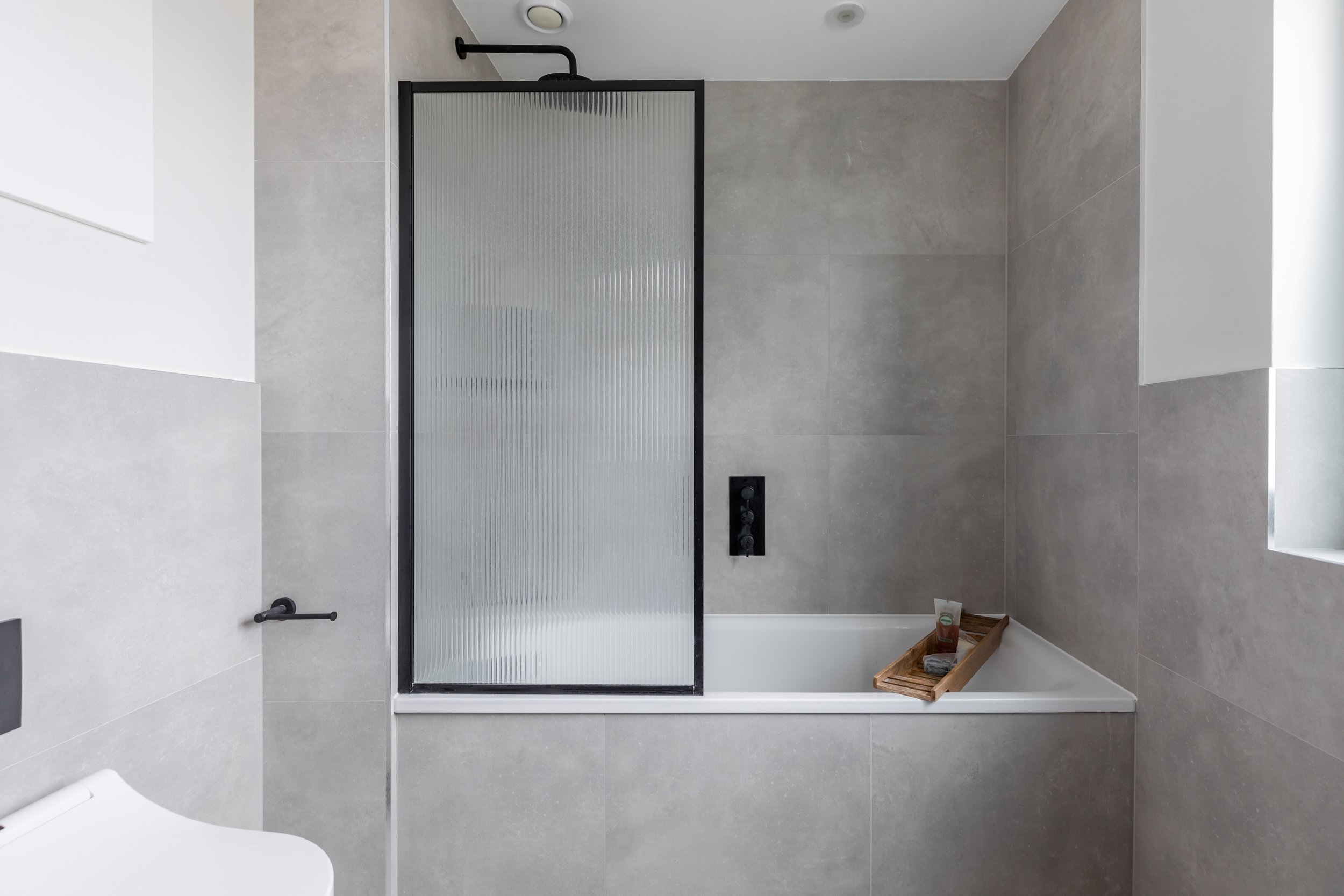
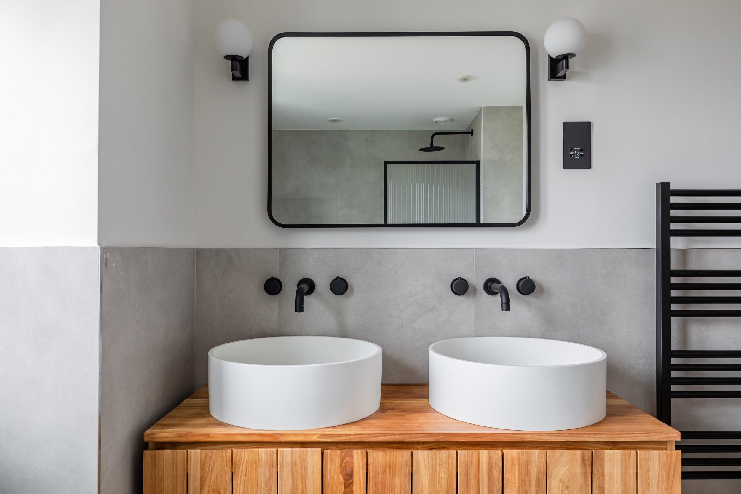
Dynamic and playful, the contemporary en suite is a sanctuary of luxe textures, tranquil tones and contrasting materials. Oversized concrete-effect tiles set a soothing yet edgy backdrop that is cleverly offset by bold matt black fittings from Crosswater. A trendy ribbed bath panel not only adds privacy, it also brings in an interesting texture that is heightened by the richly grained teak vanity from Tikamoon and silky smooth countertop basins from a disclosed supplier, for more information please enquire.
Guest space
The main bathroom reflects the en suite stylistically, with a repeat of the matt black brassware and textural timber vanity. However, it stamps its own identity with marble tiles that evoke a timeless luxury and a simple shower panel that help create a more spacious feel.
Top Tip
When choosing bathroom brassware, avoid the cheaper black or brass alternatives and invest in good quality fittings that will save you money in the long run.


