A BELSIZE PARK HOME
BELSIZE PARK HOME UPGRADE
BELSIZE PARK SUBURBS FAMILY HOME UPGRADE, LONDON, UNITED KINGDOM | BELSIZE PARK HOME UPGRADE , LONDON UK.
The Details
Who: A dynamic young professional, embarking on their first homeownership journey, seeking a space that truly mirrors their personality and style.
What: A characterful two-bedroom house spread across three levels, complete with a generous garden space.
Where: The picturesque and vibrant neighborhood of Belsize Park, London.
The Brief
The client approached us with a beautifully furnished home, yet felt that something was missing. While the major pieces were in place, the space lacked the cohesion, warmth, and unique touches that would make it a true reflection of their personal style. Our task was to transform this house into a home that exudes character, ensuring every corner feels intentional and lived in.
During our consultancy, the client made a bold decision to relocate the kitchen from its central position to a location adjacent to the garden. This shift was not only about enhancing the functionality of the space but also about fostering a seamless connection between indoor and outdoor living. The original kitchen, tucked between the Living and Dining rooms, felt disconnected and lacked the vibrancy that the client desired. By moving it closer to the garden, we created a harmonious flow that invites the outdoors in, making the kitchen a lively hub for both cooking and entertaining.
Our Approach
Our interior designer, Betina, began by delving deep into the client’s tastes, exploring their love for different colors, textures, and styles. With the existing furniture as a foundation, we identified key areas for enhancement that would bring the client’s vision to life.
Living and Dining Room: With its high ceilings and elegant bay windows, this space was ripe for transformation. Betina introduced a bold pop of color through accent pieces and incorporated a mix of textures and materials to create a layered, sophisticated look. The room now serves as a striking focal point of the home, balancing comfort with style.
Staircase: To add depth and character to the staircase without overwhelming the space, we painted the balustrade in a deep navy shade. This subtle change created a dramatic contrast, enhancing the area while maintaining the flow of natural light.
Kitchen and Office Relocation: This aspect of the project posed unique challenges. The original kitchen, now transformed into a compact yet functional office, features a narrow layout with a slanted ceiling. Conversely, the new kitchen, previously the office space, was narrower and had an angled wall that required creative planning. Despite these constraints, we achieved a cohesive and visually appealing design that integrates seamlessly with the rest of the home.
Design Journey
The project began with a 10-hour consultancy, focusing on fine-tuning the existing spaces with minimal yet impactful changes. We provided the client with a detailed shopping list and design advice, allowing them to make informed decisions on enhancing their home.
Inspired by the initial results, the client opted for two Premium Makeover packages for the new Kitchen and Office spaces. These packages included a site measurement visit, detailed floor plans, and 2D elevations, giving the client a clear vision of the final outcome.
Procurement:
Living & Dining Room:
Burnt Orange Stool – Swoon
Geometric Cushion – Oka
Gold Bowl Coffee Table Accent – West Elm
Large Pedestal Planter – West Elm
Abstract Pot – Oka
Ceiling and Wall Lights – West Elm
Kitchen:
Cabinet Doors – Naked Kitchens
Carcasses – Howdens
Handles and Knobs – Heritage Brass on Antique Brass
Bar Stools – John Lewis
Ottoman Bench in Smart Leather Tan – Swoon
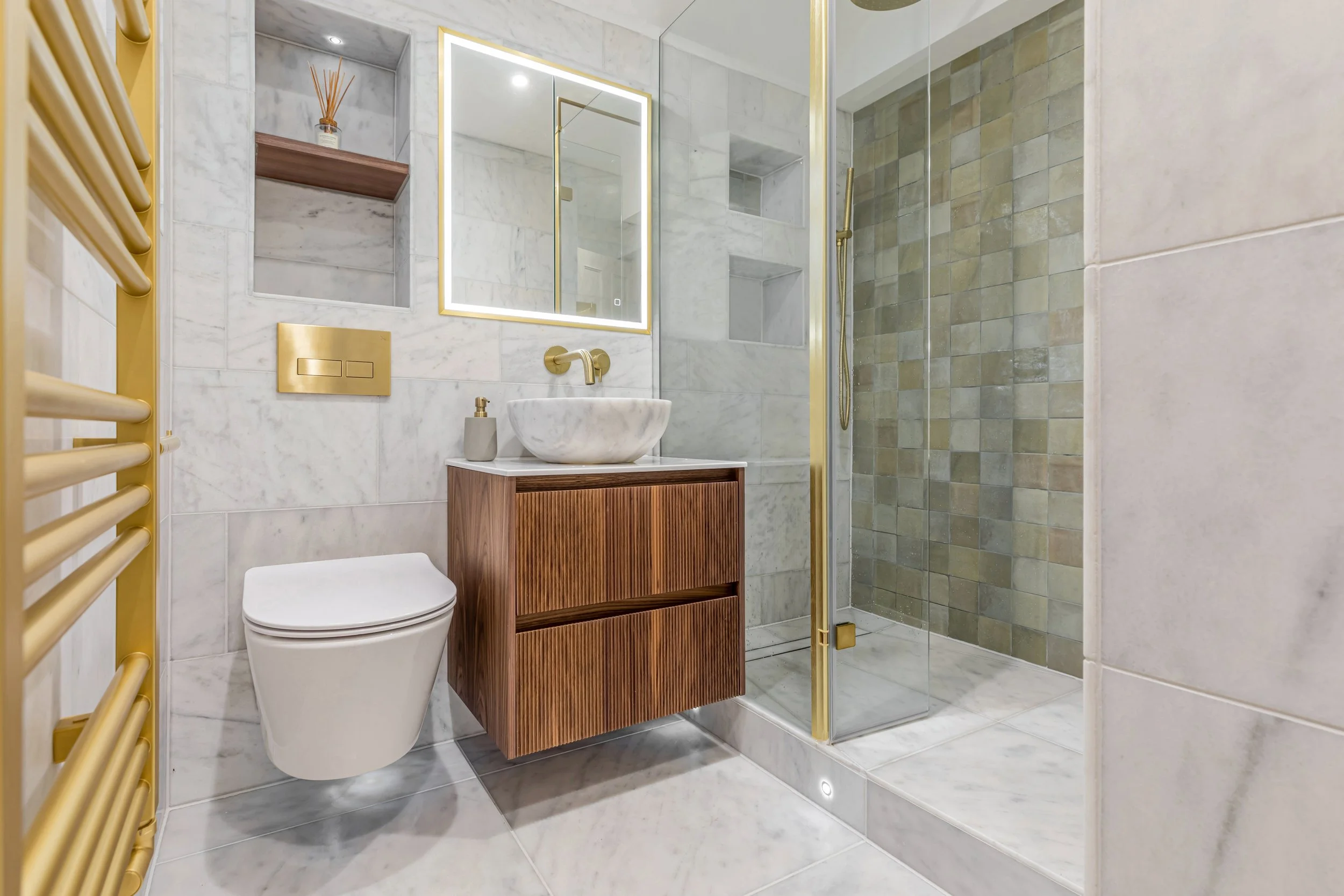
Bathroom:
Marble Tiles – Manadarin Stone
Green Tiles – Mandarin Stone
Vanity Unit – Enquire directly
Basin – Mandarin Stone
Mirror – CP Hart
Brushed Brass fittings – Drench
“Many thanks for Betina & Akiva Team for amazing project!!
I had a very rough idea of what I look for but was clueless as to how to go about it, Betina understood me immediately and walked the extra mile to deliver top results.
I was skeptical how such a cost competitive service can actually deliver, but I honestly couldn’t be happier about the Akiva’s design turnaround which was both tailored to my needs and cost efficient.
Would recommend work with Betina all day long!”


